
Patti's and Cream ice cream diner: A classic reimagination in Dunedin's food scene
11 Nov 2024
Stroll down Dunedin’s vibrant dining block on George Street and you’ll find Patti's and Cream. This ice cream diner has emerged as a sophisticated reimagining of its iconic brand, with a warm mix of classic and charming Resene colours.
Known as “the most southernly handmade ice cream parlour in the world,” Patti’s and Cream began as a small-batch ice cream brand selling seasonal flavours from a vintage Bedford food truck. By 2020, the business, owned by Olive Tabor, expanded into a scoop shop. However, the dream grew, and by 2022, Olive was ready to open a larger, seated café in the heart of Dunedin’s food district.
Interior designer Annie Simpson-King embraced the opportunity to elevate this space into a refined yet playful destination suitable for all demographics. "Being in the trendy dining block not far from Otago University, I suggested a more grown-up approach," Annie says. "The goal was to design a space that would bring a bit of edge but retain the fun of the Patti's and Cream brand.”
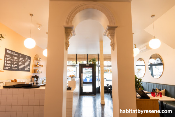
Inside the parlour, the walls are painted in a mix of Resene Flesh and Resene Double Bianca, and ceiling in Resene White ceiling paint.
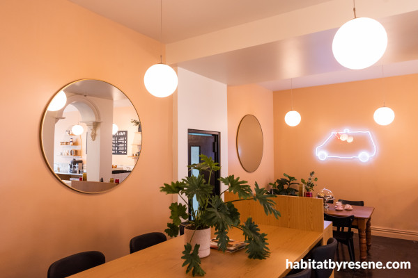
The tan hued peach of Resene Flesh was used on the walls, creating a warm, welcoming vibe for diners. The lighter walls are in Resene Double Bianca.
Central to the design is an innovative colour palette. Steering away from the “baby pink” associated with the original scoop shop, Annie selected Resene Flesh, a warm tan peach, which offers a refined and welcoming hue on the interior walls. This colour creates an inviting backdrop that ties into the café’s cosy yet lively atmosphere.
The seating areas feature dark forest green banquettes that anchor the space, providing a strong contrast to the lighter walls. To complement the warm tones of Resene Flesh, Annie selected Resene Double Bianca, a warm cream that brightens the side walls and frames the expansive windows, allowing natural light to fill the room while maintaining a sense of calm and warmth. "I wanted a more sophisticated look for Patti’s and Cream, using muted tan-based tones to add depth and elegance,” says Annie. "It’s about layering colours to enhance the brand’s established presence."

An archway in Resene Flesh leads guests to more seating, while Resene Double Bianca on walls brightens the space. Resene White ceiling paint was used on the ceiling, and Resene Black on the door and window trims.
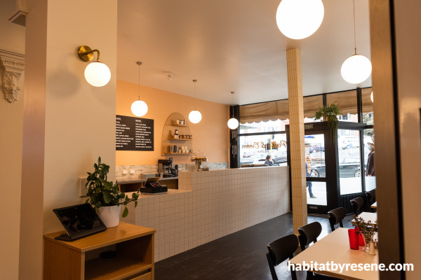
Behind the counter, Resene FX Metallic Goldmine was used to highlight the shelving, while also complementing the warm tones of Resene Flesh and Resene Double Bianca on the walls. The door provides a crisp contrast against the interior palette in Resene Black.
For a touch of luxury, Annie integrated Resene FX Metallic Goldmine. This metallic gold adds a shimmer and sophistication to both interior and exterior elements – from the floating shelves above the counter to the shop’s exterior canopy, which draws attention and invites passersby into the space. “The gold tones connect each area, adding an extra dimension,” Annie says.
The café’s design features a careful blend of materials that elevate the space with texture and visual interest. White matte tiles cover the counters, while off-white finger tiles with glittery gold grout create an eye-catching splashback. A natural jade green mosaic stone tile splashback with gold trim also adds a pop of colour while tying into the green banquettes. Large gold round mirrors and minimalistic pendant lights round out the design, enhancing the café’s chic yet welcoming ambiance.
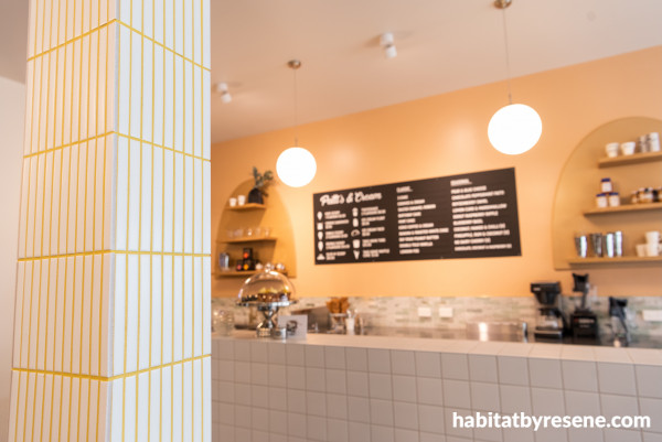
Off-white finger tiles with glittery gold grout create add a special touch to the space while complementing the warm hues in Resene Flesh and Resene FX Metallic Goldmine behind the counter.
The exterior continues the warm, inviting colour palette seen inside. Resene Flesh adorns the shop’s base, creating a visual link to the interior. The exterior canopy in Resene FX Metallic Goldmine is a bold choice that instantly draws attention and communicates the fun, elevated experience that awaits inside. Resene Double Bianca on the window frames further enhances the cohesion between indoor and outdoor aesthetics, ensuring that Patti’s and Cream stands out on the bustling George Street.
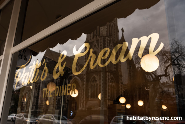
Personalised gold signage gives a classic, refined look to the parlour, while also tying into the interior colour palette.
One of the main challenges of this project was creating a space that appeals to a broad demographic while maintaining the brand’s unique identity. “I needed to think outside the square to capture a design that is welcoming to all yet distinctly Patti’s and Cream,” Annie says. Drawing inspiration from fashion, interior trends and new colour innovations, Annie brought a fresh perspective to the project, embracing Resene’s tan hues to evoke warmth and vibrancy in a way that perfectly fits the brand's growth.
This project won a Resene Total Colour Commercial Interior Public + Retail Award. The judges said: "Yum! This project not only celebrates the experience of having an ice cream but elevates it. The delicious colours call you inside, offering comfort and the warmest of welcomes – then cosily wrap around you, encouraging you to stay. A scrumptious evolution of this brand's story."
Patti's and Cream has successfully transitioned from a beloved food truck to a stylish brick-and-mortar establishment. Through bold colours, thoughtful layout and an elevated design, Annie Simpson-King has created a space that invites everyone – from ice cream lovers to casual diners – to experience a taste of Dunedin's finest in style.
design Annie Simpson-King, SimpsonKing Design
build Harlan Joinery
images Kelsey Frost Photography
signage DLB Signage
Published: 11 Nov 2024




 look book