
latest
habitat tv

Say goodbye to the morning scramble for keys, coats and sunglasses and hello to this… see this and more videos
blog

Reader roundup: School art, re-used paint buckets and fresh exteriors
We’ve got a great mix of projects to show you this month. We absolutely love… more
Squeeze in these citrus-inspired paint colours to add some zest to your design
17 Apr 2023
While not every colour that becomes a hit in the fashion world trickles down into the architecture and interior design spheres, fashion is undoubtedly the primary influencer of decorating colour trends. Though it can take anywhere from six to 18 months for popular hues to take hold, it’s always worth paying attention to what’s on the runway now if you want to see what’s coming down the line to these other areas of design – particularly if it will take some time for your project to reach occupancy.
Looking back at the highlights of this year’s editions of Fashion Week in New York, Paris, Milan and London, nearly every runway show shared some key colours in common. Among the most eye-catching were the bold yellows, oranges and greens that chromatically compare to citrus fruits. Although there is a time and a place where hues as vibrant as these will be welcomed as part of your project’s colour palette, we have already started seeing the many creative ways designers are incorporating citrus tones into the interiors and exteriors of their building projects on social media. If a portion of your project needs to command attention or would benefit from a jolt of energy, don’t look past these popular Resene paint colours to add a zesty spritz of citrus to your design.
Lemony yellows
After a few challenging years of being bombarded with bad news, it is both refreshing and understandable that a colour like lemon yellow has become a top colour trend. With the exception of a few cultural variances, yellow is commonly associated with sunshine, happiness, optimism and joy. There are few colours quite as effective at introducing energy into a space or directing eyeballs to an architectural feature than Resene I Dare You, Resene Light Fantastic, Resene Thumbs Up and Resene Hot Toddy, and some studies have even shown that yellows like these can increase appetite (which is why you often see hues like these as part of the colour scheme at prolific restaurant chains).
Both dark and light greys like Resene Half Gravel and Resene Delta work well with lemon yellows, but blue is another solid choice. Darker midnight and navy blues such as Resene Indian Ink and Resene Epic can help to tone down the intensity of lemon tones, while a bright shade of a cobalt like Resene Wet N Wild can really pop when paired with yellow. Crisp blacks like Resene Nero and whites like Resene Alabaster are other classic pairings that can stand up to the strength of lemon yellow, but for an extra trendy colour palette, try a touch of lemon yellow with other strong accent hues like lilac pinks, brick oranges or grassy greens like Resene Petal, Resene Tuscany and Resene Rolling Hills backed with yellow-edged whites and soft creams like Resene Rice Cake, Resene Quarter Spanish White or Resene Creme De La Creme. In a location like a retail shop or cafe, an of-the-moment colour combination like this practically screams cool.
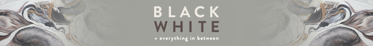
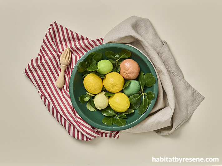
Background in Resene Creme De La Creme with bowl in Resene Rolling Hills and fruit in Resene Aloe Vera, Resene Staycation, Resene Wellywood, Resene Illuminate, Resene I Dare You, Resene Light Fantastic and Resene Tuscany.
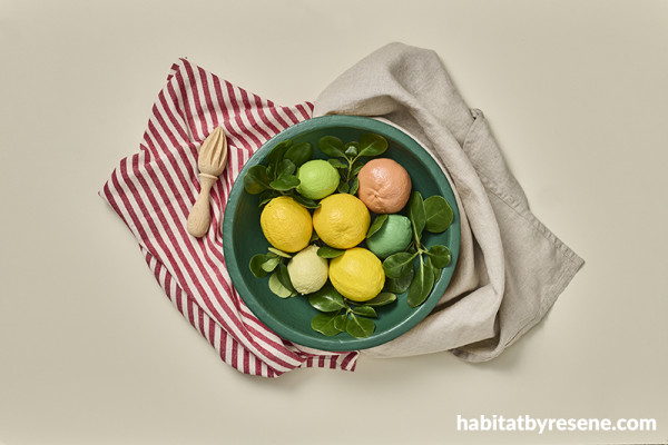
Background in Resene Quarter Spanish White with A4 drawdown paint swatches in (from left to right) Resene Twisted Sister, Resene Swiss Caramel, Resene Moccasin and Resene Thumbs Up, bowl in Resene Moonbeam and vase (left, on side) in Resene Yuma.
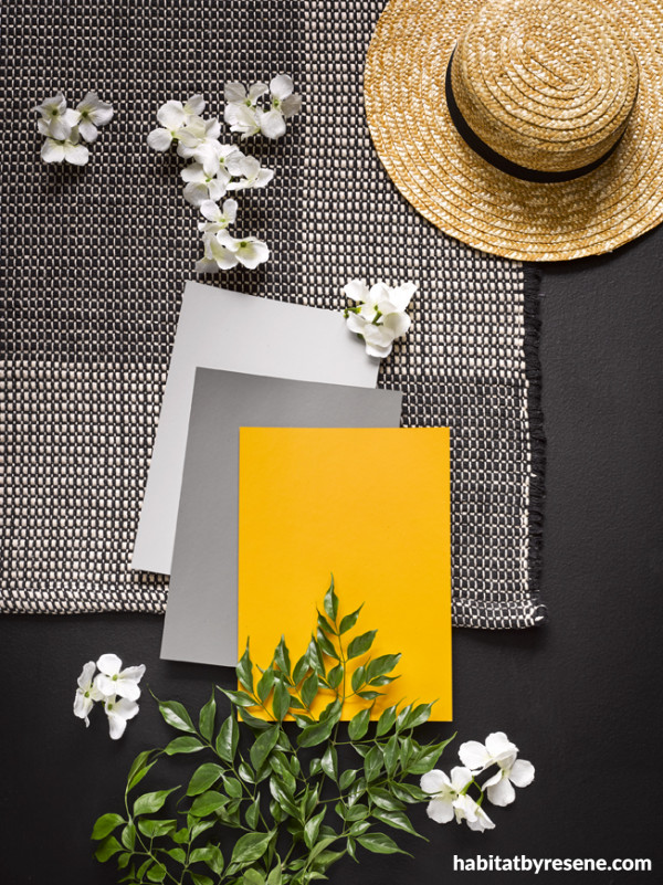
Background in Resene Nero with A4 drawdown swatches in (from top left to bottom right) Resene Half Gravel, Resene Delta and Resene Hot Toddy.
Bitter oranges
Despite it having a fair share of positive associations from a colour theory perspective, orange is often one of the more polarising hues out there. Those who love it usually love it a lot, but it can be a tougher sell for others. Of course, when it comes to challenging hues, it’s all about choosing the right variation.
Like lemon yellow, orange is vibrant, energetic and warming. In places where leaves turn brighter shades in the autumn months, orange is often synonymous with change and movement since the hue heralds the coming of cooler weather – but it is also strongly associated with creativity, making it an intriguing option for a meeting room in a commercial office setting. Bitter oranges – those with brown or dusty undertones – can be surprisingly easy to spend time around in a residential setting for their warmth and cosiness. Naturally, Resene Ayers Rock works well with other earthy browns like Resene Alert Tan and Resene Digeridoo, but we also like it with rich classic creams like Resene Triple Pearl Lusta or greyed olive greens like Resene Evolution. For a more dramatic look suitable for a restaurant, try it with a bold purple-edged blue like Resene Decadence. Or swap Resene Ayers Rock for a more amped-up orange like Resene Sebedee, which blends better with popular pink tones like Resene Pink Lace or Resene Hopbush and summery blues like Resene Sailaway or Resene Skylight.
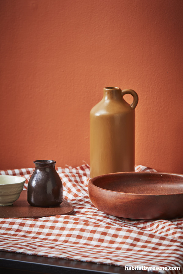
Wall painted in Resene Ayers Rock, jug vase in Resene Alert Tan and bud vase in Resene Digeridoo.
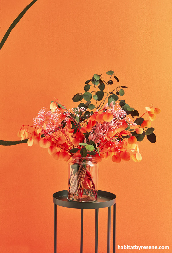
Wall painted in Resene Sebedee with design and table in Resene Log Cabin.
Zesty limes
Green has been among the most popular colour trends over the past few years, when earthy browned and greyed forest hues have been widely used inside and out as a way to calm our frazzled minds. But the more acidic variations of green that are gaining traction today share the energetic traits of the aforementioned lemon and orange citrus tones.
Resene Staycation and Resene Lemon Ginger are lively on-trend green options that both pack a serious punch of colour and lend themselves well as an accent to deeper palettes of holly greens like Resene Rolling Hills or yellow-based blues like Resene Tangaroa. But if you’re looking for something that’s still zesty but perhaps a little less electric, bluer greens like Resene Boundless and Resene Stromboli are more liveable trending options that pair well with hazy pale blues and greens like Resene Duck Egg Blue, Resene Morning Haze or Resene Transcend. Or opt for more balanced lime greens closer to the actual colour of the fruit’s peel like Resene Good To Go and Resene Aloe Vera for a refreshing colour to liven up a monochromatic nature-inspired palette of Resene Springtime, Resene Seaweed, Resene Vantage Point and Resene Field Day in a home or commercial office.
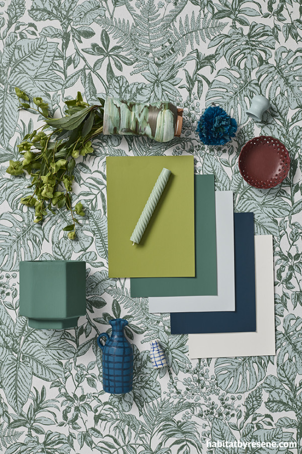
Background in Resene Wallpaper Collection 37520-2 with A4 drawdown paint swatches in (from top left to bottom right) Resene Lemon Ginger, Resene Stromboli, Resene Half Duck Egg Blue, Resene Tangaroa and Resene Rice Cake, hexagonal plant pot in Resene Stromboli, jug vase in Resene St Kilda with painted grid design in Resene Tangaroa, candle and tiny pot in Resene Sorrento and lace-edge dish in Resene Scoria.
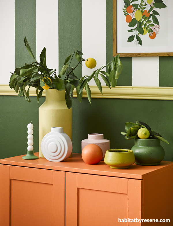
Lower wall painted in Resene Clover with upper stripes in Resene Clover and Resene Rice Cake, cabinet and round ornament in Resene Smoke Tree, tall vase and dado rail in Resene Chenin, candleholder in Resene Dingley, circle vase in Resene Rice Cake, pink vase in Resene Paper Doll, low dish in Resene Lemon Ginger, and low vase (with lemon) in Resene Clover.
Curious what other colours are in currently fashion? Check out the latest Resene The Range fashion fandeck for more popular picks, which have been curated in consideration with what’s on the runway. Each of these hues can be ordered as A4 drawdown paint swatches so that they can be viewed together at a larger scale. Be sure to view your Resene paint colours in-situ wherever possible so you and your client can be confident of your colour choices.
projects Gem Adams, Kate Alexander, Amber Armitage, Megan Harrison-Turner, Laura Lynn Johnston, Vanessa Nouwens
images Bryce Carleton, Melanie Jenkins, Wendy Fenwick
Published: 17 Apr 2023
more inspiration

Turn the spotlight on your design’s best features with this trending painting technique
If you spend any of your day interacting with social… more

Bloesem Early Learning: A nurturing palette for growing minds
Right in the heart of Mount Maunganui, Bloesem Early Learning… more

Nat Davis marks a new chapter in New Zealand’s interior design story
With a passion for design and an extraordinary multifaceted career,… more

George Rose’s towering mural transforms Darwin’s skyline
The Darwin Street Art Festival (DSAF) has long been a… more

Transform your next project with the Annabel Taylor Home Wallpaper Collection
A stunning new wallpaper collection has arrived at Resene ColorShops,… more


 look book